What is Visual Weight?
Are you familiar with the term “visual weight” as it applies to composition?
The concept of visual weight often gets overlooked for more familiar principles like rule-of-thirds, yet it’s one of the most basic and fundamental concepts in photography.
Essentially, visual weight refers how much an element in a composition draws the viewer’s eye. A subject with “high” or “heavy” visual weight will capture a lot of attention, while also detracting attention from the rest of the image at the same time.
For example, in a portrait, we’re drawn to the subject’s face. Therefore the face carries the most visual weight. The other elements are important, yet they are secondary.
So what about when we’re talking food photography?
How can we use this principle to compose our photos and make the most of the image elements we’re working with?
Why is Visual Weight Important?
To utilize visual weight well in a photography, you need to understand how it works and why it’s important.
If you know anything about how our vision functions, you’ll know that we actually “see” with our brain rather than our eyes. The eyes are somewhat of a conduit. We need them, but the real action happens inside our heads.
When light hits the retina of our eye, cells called photoreceptors turn the light into electrical signals. These electrical signals travel from the retina through the optic nerve to the brain. The brain then turns these signals into the images you see.
Psychology and other physical senses affect how we interpret the world around us.
For example, we experience gravity here on Earth. When we look at an image, we have a subconscious assumption that the different elements within it can fall to the ground.
This means that our sense of balance has a profound effect on the way we read and experience an image, and that as humans we’re constantly seeking equilibrium—searching for balance in everything we see.
Balance is therefore key in food photography composition.
Composition and the Centre of Gravity
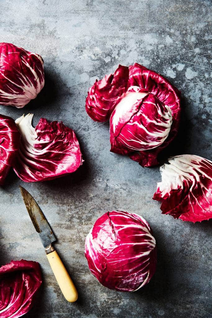
The centre of gravity in an image is at the center of the frame. In general, placing the subject in the middle of the photo is one way to create balance. Portrait photographers use this principle to great effect.
A popular approach in food photography is to shoot overhead and place the dish in the center of the frame. This way, the focus is on the food rather than the composition. As long as the flattening of depth that occurs when shooting at ninety degrees isn’t detrimental to the subject, this simple approach can give you a pleasing result. It’s an approach that I like to use myself from time to time.
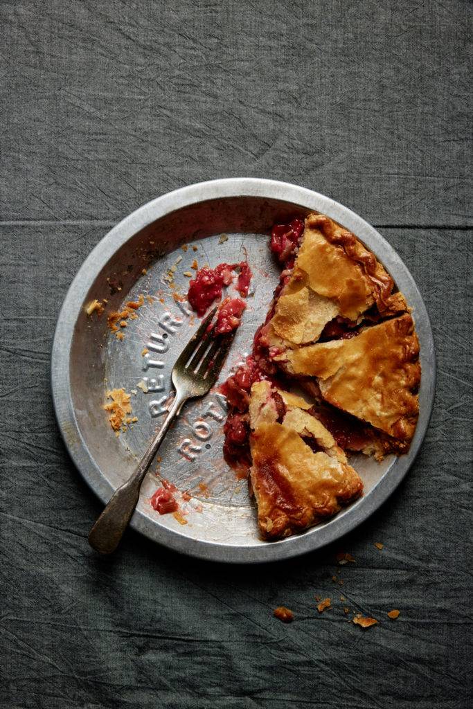
They key is to be fairly cropped in for this style of image. When the eye is directed to the center of a photo, it has a tendency to wander off and look for more visual stimulation elsewhere.
Most of the time, we elect to place our main subjects somewhere off center when composing our food photos. However, the further away from center it is, the more the viewer will look for justification for this positioning.
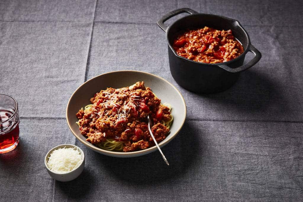
Offsetting the subject further from the center gives it more weight, therefore requiring elements like props, smaller dishes and styling elements like napkins to balance the dominance of the the subject.
Reading from Left to Right
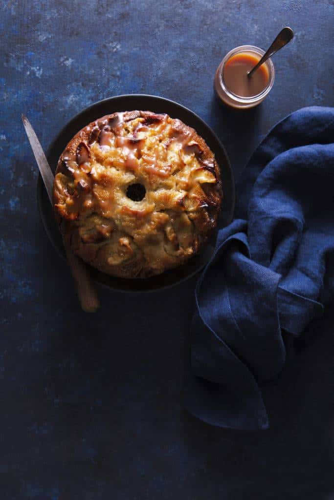
In the West, we read from left to right. This hugely influence how we “read” a photo as well. Elements to the right of an image carry more visual weight than those placed on the left. We also tend to identify with a subject on the left, as it will appear closer and less “heavy” than one placed on the right.
If you live in a part of the world that reads in a different direction, cultural conditioning will affect how you experience a photo.
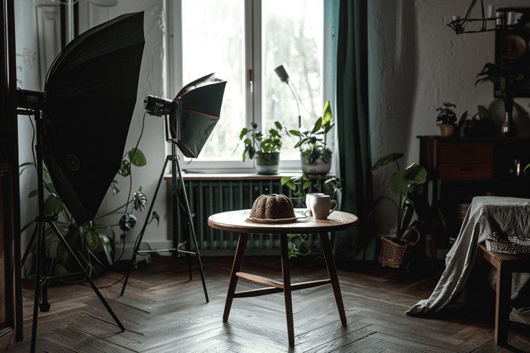
I often light my food photography on the left because the eye is first attracted to the brightest part of the frame. By positioning my light where the viewer’s eye enters the photo, I can create an image with a natural flow.
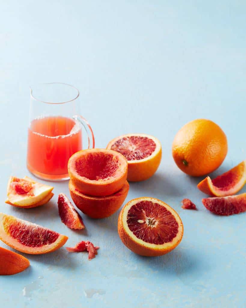
This is not to say that you can’t light from the right, but note that this will effect how you compose an image and how the viewer experiences it.
Also note that if you live in a culture that reads from left to right, having heavier visual weight on the left will feel more balanced. Movement to the right will have and greater sense of ease and flow, whereas movement to the left will seem more challenging, as its perceived as going against this natural flow.
Factors That Influence Weight
Many factors other than the size of a visual elements affect the weight of a photo.
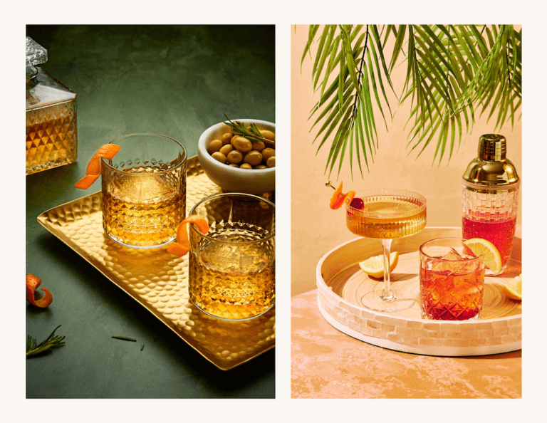
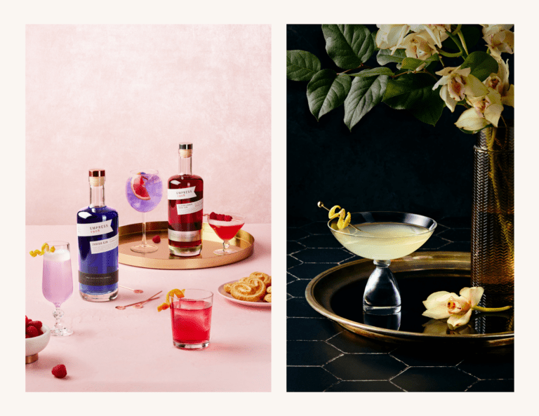
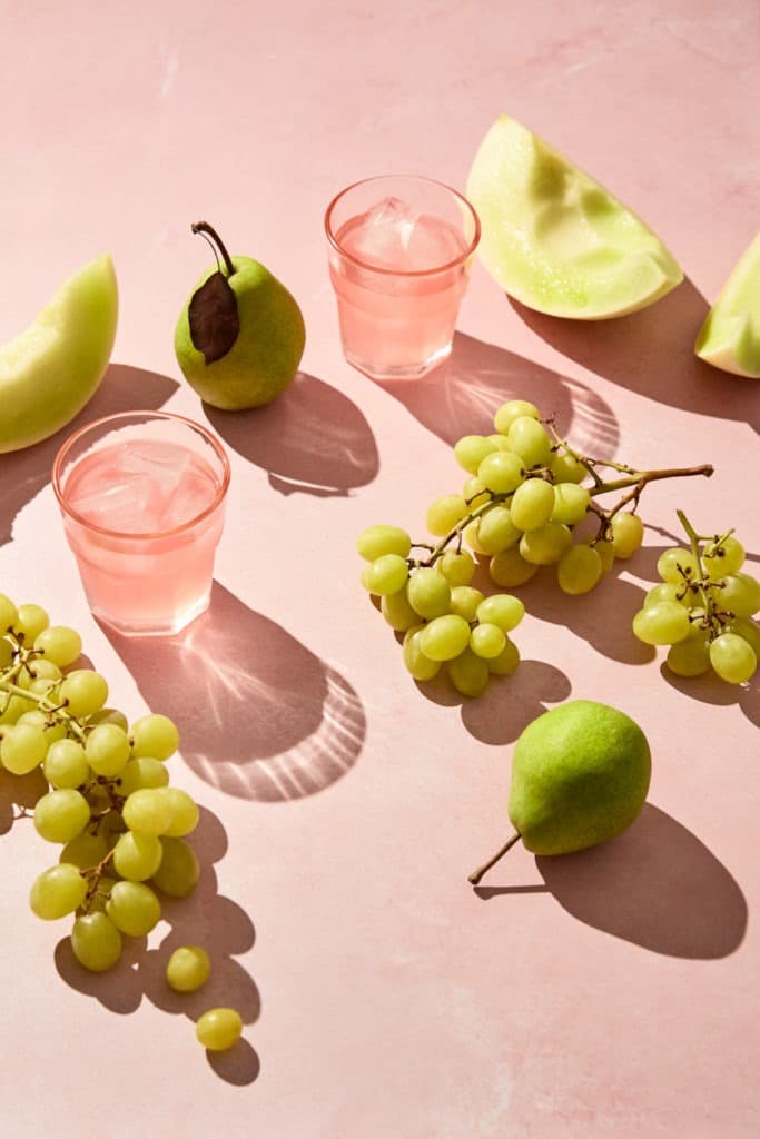
For example, different colors carry different weights. Brighter colors tend to carry more visual weight than muted colors because they draw more attention to themselves.
When using different colors in a composition, the arrangement and proportion of the colors and how we group them together or spread them out becomes crucial.
An element in the foreground of an image will carry more weight than one in the back of the image, whereas elements at the top will also be perceived as heavier.
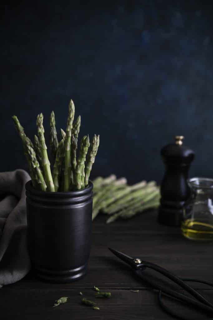
One mistake many new food photographers make is to position a large element at the bottom of the frame and then cut it off. This blocks the eye from moving fluidly around the frame and retaining interest, and adds too much visual weight where it is not natural to the eye, thus placing the composition off balance.
On the other hand, placing small elements on the edges of a frame adds tension to the photograph and keeps the eye interested in what’s going on in the frame.
In Conclusion
To help you understand the concept of visual weight in action, conduct a couple of experiments with the above principles in mind:
a.) Take a shot with your food subject placed on the left of the frame with some smaller elements on the right. Then switch them so the subject is on the right, with the smaller elements on the light. Observe the difference. Which appears more balanced to you? What feels different in the photos?
b.) Set up a shot with your camera angle straight on. Take a shot with your light positioned on the left. Now move your light to the right side and take another shot without moving your set-up. How does the light affect your subject/scene?
Share your comments below or in my Facebook Group.
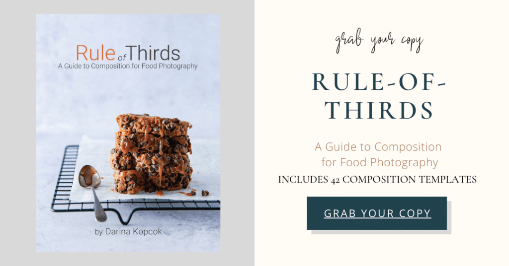
For more composition tips, be sure to check out Rule-of-Thirds: A Guide to Composition for Food Photography. You’ll learn all the basics about important principles in composing your food photos such as the Golden ration. This interactive PDF ebook also has 42 templates that you an use as guides to help you set up your food photos in a way that follows the principles of good composition.
