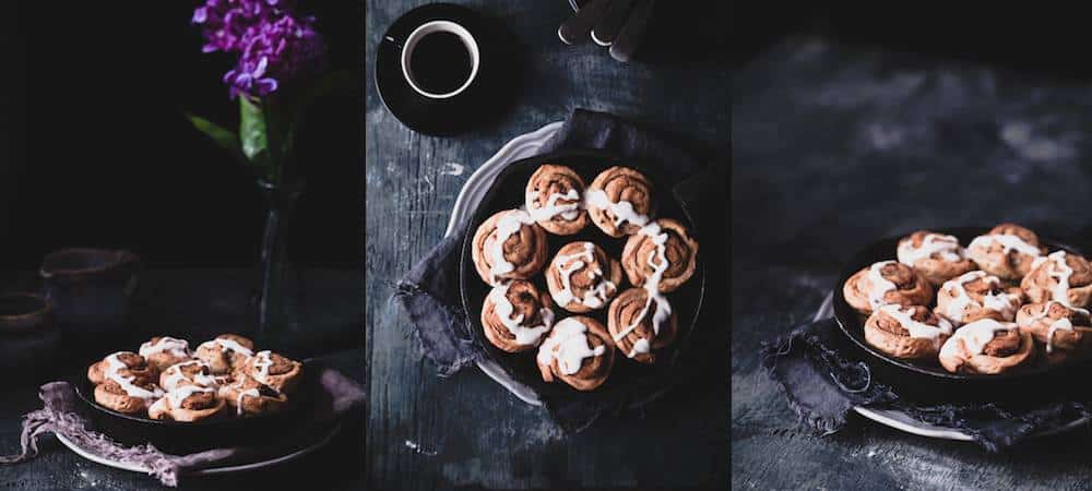
How to create dark and dramatic food images in what is often referred to as the chiaroscuro style.
Over the last several years a trend towards dark, shadowy images has emerged among the various styles popular in food photography. These photographs have a moody atmosphere and rustic feel, and call to mind the interplay of light and shadow in the paintings of the Old Masters such as Vermeer and Rembrandt. The style is often referred to “mystic light” or “chiaroscuro” photography–the latter a painting term borrowed from the art world to refer to the contrast between the shadows and light in a painting, which creates a dramatic mood. In a food photo, chiaroscuro arouses the emotions of the viewer and creates a deep sense of atmosphere, which is why I am personally so drawn to this style and use it extensively in my work.
The way I approach my shoots really depends on the food I’m photographing. Sometimes a dark, somber image is not appropriate to my subject. However, as a blogger who creates recipes that typically fall into the category of comfort food, chiaroscuro is a style that often suits the story I am trying to tell.
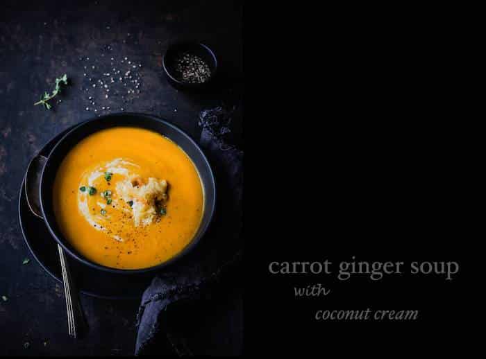
For example, in the picture below I imagined someone sitting down at a farmhouse table to eat a bowl of hot soup on a chilly winter’s day. I envisioned that late afternoon light was spilling in from a window onto my scene. This food story is one that I often use in my work, in one form or another, and chiaroscuro is the perfect style to bring it to life.
So let’s take a closer look at the various elements of chiaroscuro and how I apply them to my food photography.
Props and Backgrounds
I use a lot of vintage and antique props, wood surfaces, and natural fabrics such as linen in my set-ups. Texture and layers are key and a lot of my fabrics don’t have finished edges and certainly are not ironed into perfectly creased rectangle! The crumpled look goes well with that idea of a food story being told. Of a meal being eaten in media res.
For the most part, I use props in dark and muted colours. I find this works best with the overall feeling of the image in chiaroscuro photography, which is so much about the shadows. A white dish stands out too much and detracts the eye from the food. Technically, it can also be difficult to photograph against a dark scene.
I’m constantly rummaging through secondhand shops and antique stores. Someone else’s junk is often my treasure. I’m always on the lookout for tarnished silver cutlery, dishes in grey, dark blue and black, old baking sheets to use as a background or surface, and vintage pie plates, cake pans and serving utensils. I think props that look vintage or well used go very well with a rustic chiaroscuro style. Wooden surfaces and backdrops are also a perfect to add to this effect. I have some old fence posts that I lay down on a table to mimic an old picnic table and am currently on the hunt for an old tabletop or barn door. They can be hard to find, so I have bought many wood remnants from the hardware store and have painted them myself. There are a lot of great tutorials online on how to create an antique or distressed look on newer pieces of wood.
While I like to give my images a sense of place, I think you still need to be careful about using too many props and taking away from the food. The food still needs to be the star.
I prefer cooler tones in my backgrounds and props, and in my images overall. I am so inspired by the cool tones and Nordic light in the photographs of Danish photographers Ditte Isager and Mikkel Vang, who have shot cookboks for Gordon Ramsey and Ruth Reichl respectively.
Food Styling
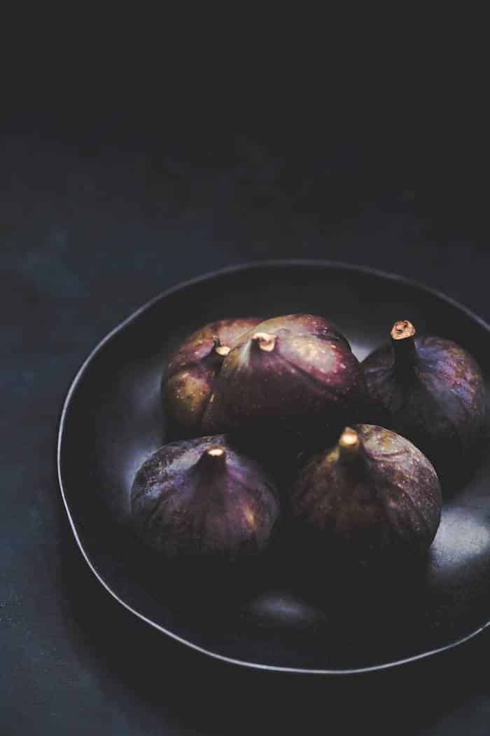
Commercial food photography still demands perfectly stylized food but editorial photography—where you most find the chiaroscuro style—often has an honest, candid quality to it. In other words, the food is perfectly imperfect, with crumbs scattered on the tabletop, smears and drips, as if it has been freshly prepared or someone has just started to tuck in.
This style is easier to pull off than the painstakingly styled McDonald’s hamburger advertisement, but it also takes some deliberate effort. There is a fine line between raw and rustic and downright sloppy and it takes practice to make it look casual and random.
Working with Light
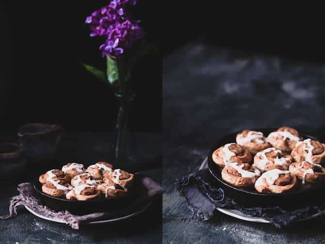
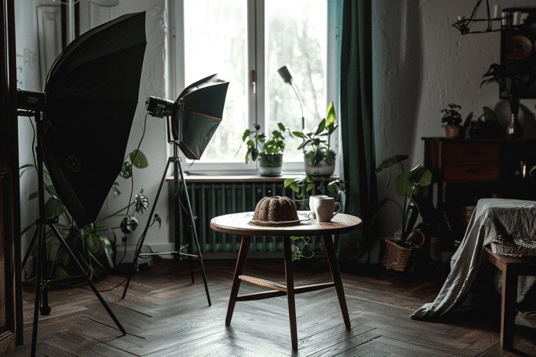
Whether I am working with natural window light or artificial light, I block portions of light with black foam core and poster board. A typical food photography set-up requires a white fill card to bounce the ambient light back into the scene and fill in shadows. This doesn’t work in chiaroscuro photography. You need to absorb the light strategically to create the deep shadows inherent in the style, and this calls for black materials.
To give the illusion of light streaming through a window as in the image of the bowl of chilli below, I actually blocked off most of my light source, leaving a small rectangle of light to fall onto my scene. Generally, you want to make sure that your light source is on the same level as the surface you are shooting on or that it is hitting your surface broadly enough to scatter the light appropriately into your scene. This is particularly important when you are shooting overhead shots.
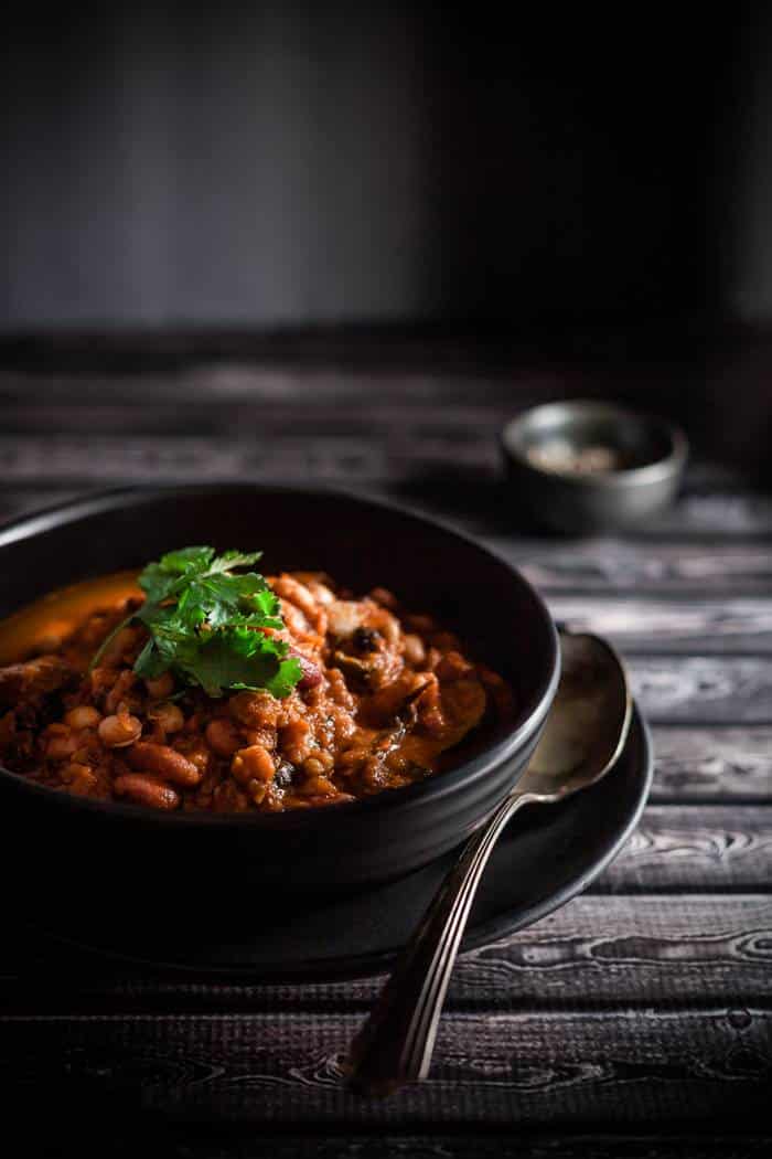
When photographing in natural light, this can mean shooting on the floor next to a sliding door window. It is also usually preferable to shoot with your set at a bit of an angle away from your light instead of perfectly vertical, which will result in side backlighting and allow for the light to come in at more of an angle and wrap around the food in a way that brings out its best qualities.
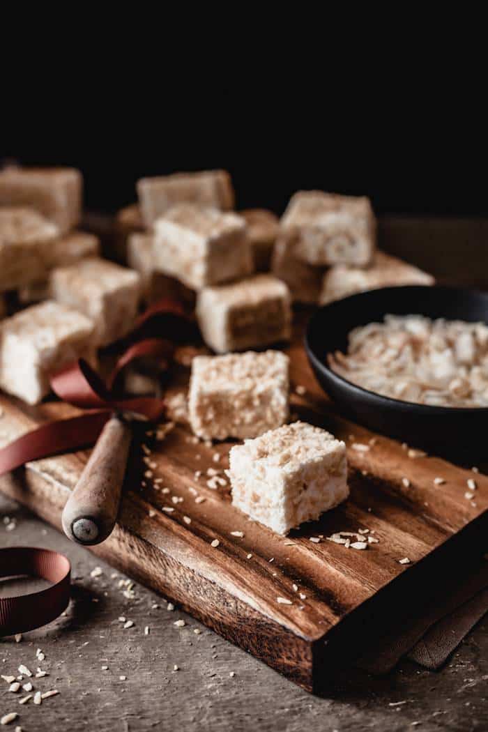
For this image of toasted coconut marshmallows, I placed a strobe on the left of the set and blocked out the back third or so with black foamcore from the dollar store. On the right side, I used black foamcore on the entire side to absorb the light from the flash bouncing back into the scene. I cut mine into all sort of shapes and sizes, depending on how I want to create the shadows.
Exposure
I always slightly underexpose my “darker” images. My biggest mistake in food photography for years–especially when shooting brighter images–was to overexpose my shots. This works well with film but it does not work for digital. With digital, it is near impossible to bring back lost detail from blown out highlights. It is much easier to recover detail in the shadows. If you struggle with exposure, then shoot for zero and make adjustments in post. I find this particularly important if you use presets. No preset can fix an incorrectly exposed image and salvaging it to some level will require tons of tweaking, thus negating the benefit of using a preset, which is to save you time.
Post Processing
One of my pet peeves are chiaroscuro images that look totally underexposed. Like in every part of the photograph. There is a difference between low contrast, low key images and images that have not been exposed correctly.
As I mentioned, I underexpose my images BUT I use the adjustment brush in Lightroom to selectively paint my desired exposure in the areas I want them—mostly parts of my dish. I like my food to be on the brighter side, to draw the eye and put the focus on the food, as well as contrast with my set and give life to the image overall. The eye will always be drawn to the lightest part of an image.
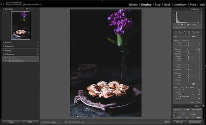
I also said that I prefer cooler tones in my images, however, most food looks better when it’s on the warmer side. The adjustment brush comes in handy to bump up the warmth on the food without affecting the whole image. The split toning slider in Lightroom is also great for playing with the tones in the shadows and highlights as long as you use a gentle hand.
One other tool I sometimes use is the radial filter in Lightroom, which I use to selectively adjust the exposure in areas where the shadows are too dark. A lesson I learned early on is that it’s best to get things right in camera; it makes you a better photographer and keeps you from having to spend hours in post.
Lastly, I always sharpen my images and reduce noise if it’s is adding too much graininess to my images. To finish my images, I almost always add at least a bit of a vignette to the edges.
If this sounds like a lot of work and editing, it’s actually not. I don’t think it’s a good idea to process food shots too much. However, they do need some processing. A digital negative is just like a film negative in that it needs to be processed. Just like we used to take film to the lab, we have to do something to our digital. Digitals tend to be flat and dull straight out of camera and need a bit of a boost in contrast and vibrance, and usually tweaking in the shadows and the highlights. It doesn’t take much to make the food pop if you know what adjustments to make.
I hope this post has given you some inspiration to try chiaroscuro photography. I’d love to hear about your results in my Facebook page 🙂



11 Responses
Darina, thank you so much for this detailed post! I am a total newbie at photography and am still figuring out how to shoot with natural light 😛 But I always love the look of these moody shots, and have always thought they were so out of reach! I’m looking forward to trying your tips and experimenting (and hopefully in a year getting it right! haha).
You are very welcome, Sophie! I’m glad it helped. I almost find it easier to shoot this way because it’s how I started shooting earlier on in my photography. I find that photography is something one never completely masters but with a lot of practice you can improve dramatically. I started seven years ago and am still learning new things, but that is part of the fun 🙂 Thanks for stopping by. Good luck and let me know if you have any questions.
Hi darinako,
I have popped over from BYW after reading your homework post and am entranced! your blog is both beautiful and very informative! My photography style is very light and bright – I have OCCASIONALLY tried these dark and moody shots with little success though. Your advice about not using white dishes on dark backgrounds has possibly solved my main problem as all my crockery is white – time for a few more props I think! Keep up the good work – your blog has so much potential.
Thank you so much, Julie! Glad to know the information was helpful. I like the bright and white, too. It seems I gravitate towards either end of the lightness/darkness spectrum and not so much to what is in between lol. I’m going to check out your blog now 🙂 Thanks for stopping by.
Just wanted to add that I am your first follower on Bloglovin! That is my PREFERRED way to follow blogs as it dosen’t clutter my email and I can always catch up on my blog reading when I have a spare half hour.
Thanks, Julie. I’m following you now, too. Thank you for introducing me to Bloglovin!
Hi Darina, Such a wonderful post! I think this tips and tutorials would help me build my own restaurant menu in the near future. customers would most likely get attached and curious with the menu since the photos are eye catching, classy and tempting. what do you think about my plan? 🙂
I definitely agree since we eat with our eyes first! 😉 I’m glad that you found the post helpful. 🙂
Hi Darina, Thanks for writing this up. I am a web designer but haven’t thought of the importance and value of creating or designing a template for restaurants and food lovers. I think the images really has a great impact to audiences. This is really great! It gave me the idea to design one. There’s no harm in trying, right? 🙂
Dear Darina,
Thank you for your generosity in sharing tips and ideas.
I am not a photographer at all, but a chef trying to have a go at taking my own pictures for my website. I am so happy that I have stumbled upon your article!
Suzaan
Thank you so much for stopping by, Suzaan!