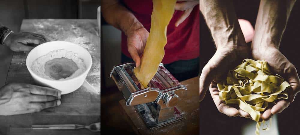
In my own photographic journey, I have found that my style keeps evolving.
There is a saying that the last picture you take will not be so different from your first. I believe this is true in that we all see things in our own unique way, and given the same tools and subject, every artist will have a different interpretation.
At the same time, we are always progressing, finding our voice, and honing our style. I can identify the work of photographers that I admire on sight; their style is as unique and immediately identifiable as a cubist painting by Picasso.
For years, the most important questions in my photography were related to the technical aspects. Learning the triangular relationship of aperture, shutter speed and ISO. The functions of my camera. Inverse square law and the way it influences how light hits my subject. Photoshop!
In addition to considerations such as composition and working with light, photography has an immense learning curve.
As I have increased my competency in the technical areas, the more free I’ve become to experiment with my style.
The biggest change for me has been going from photographing food on a plate in a way that makes it look most appetizing to also considering the elements of visual storytelling as having a major impact on my final result. For me, the story is the main theme in my attempts to capture the people, culture, and events around food. Whether I am documenting a scene or creating one, light and composition are the tools used to express this theme.
Here are the main considerations in visual storytelling:
What is My Idea?
I always begin with an idea.
What is the setting or experience I am attempting to capture?
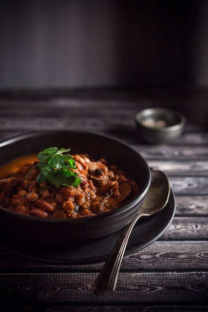
For example, in the first picture below, my idea was someone sitting down to eat chili in a farmhouse setting. Late afternoon winter light is coming into the room from a window on the right and spilling onto a wooden table.
This made sense to me, as chili is typically a meal enjoyed in the cooler months, and this was an idea that fit well with the rustic feel that is inherent in my work. Because I wanted to create a moodier atmosphere, I chose a dark background and props.
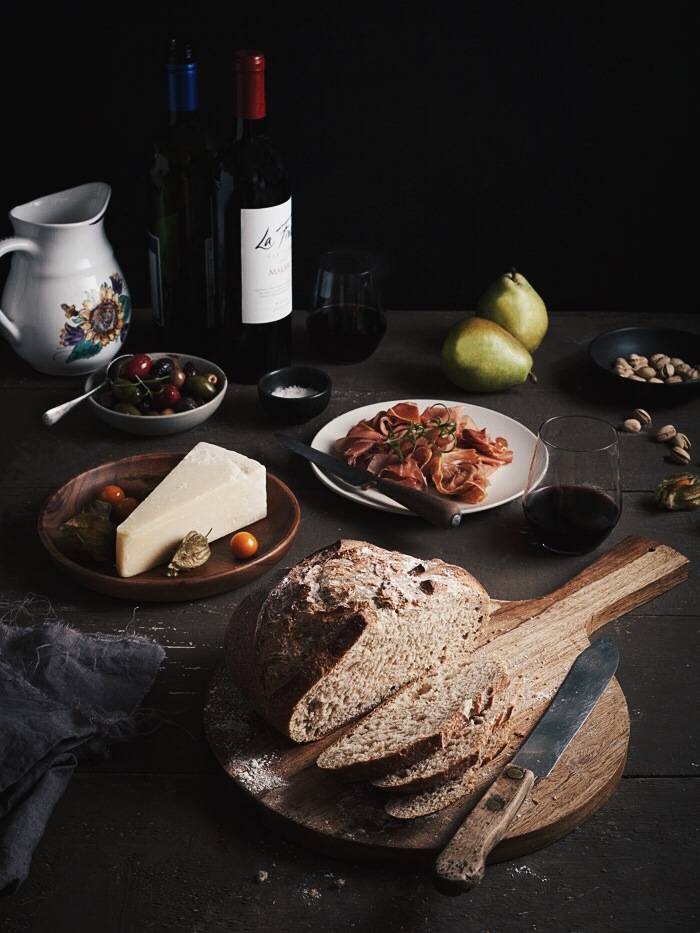
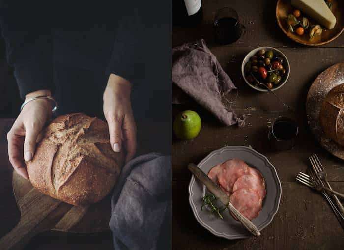
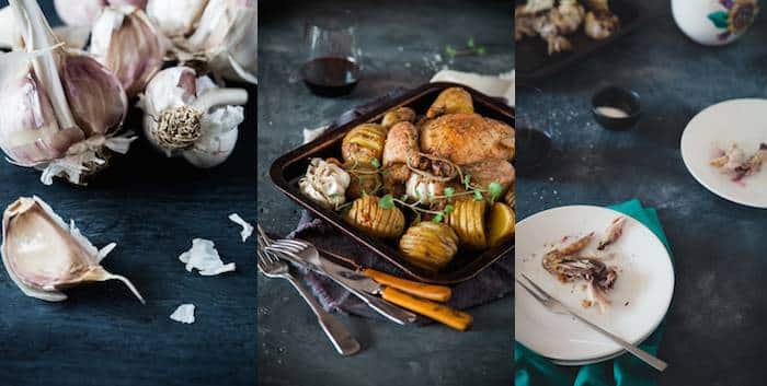
In the second image, the idea was “weekend lunch”. I wanted to capture the essence of a European-style lunch made up of a variety of charcuterie, served with wine and a loaf of crusty country bread. Again, the great deal of shadow in the image creates a moody atmosphere and gives the sense that it is winter or a cooler time of year.
What Are the Elements I Want to Focus On?
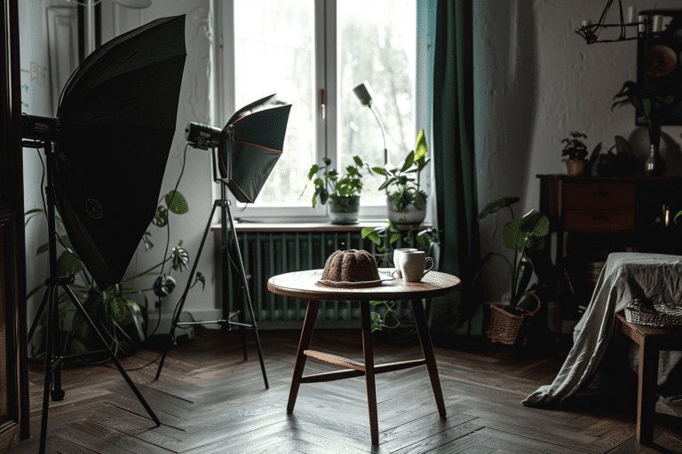
Most of the time, I create my own scenes in my home studio with a variety of backgrounds and surfaces.
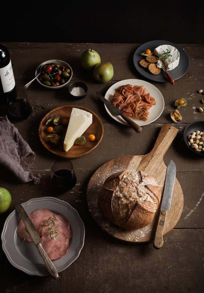
I don’t have a lot of space, which has forced me get creative with the resources I do have. I created this weekend lunch scene with wooden planks set across my coffee table. The image that follows was a set that I created with a table and chair and a backdrop to hide some cabinetry that would have been distracting in my photo.
The image is full of shadows, but there is a bright area which indicates that daylight is spilling in from a window onto the scene. I really wanted to work with this idea in the context of a larger scene with a more complex composition.
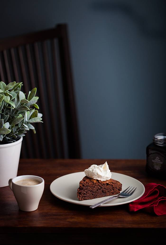
However, lifestyle imagery in particular can require documenting a certain scene instead of creating one, such as coffee taken in café or a picnic in the park.
These kinds of images are wildly popular on Instagram and in food magazines, and provide a great opportunity for visual storytelling.
For this type of photography, focus on the most important elements you want to work with. Is it the cool colour palette of a late afternoon barbeque at the beach? The shadows and low grey light of an English teahouse? The bright and airy feel and greenery of a summertime picnic?
Think of what is going on in the image and how your styling, composition and perhaps models will express this. Think of the people in your shots as your actors; they are there to tell your story.
Create a series containing three to five images that tell your story from start to finish. This can mean opening with a photograph that sets the scene, a process shot or two, followed by an image where the final product is being enjoyed.
One complaint I’ve heard over and over from blog audiences is that they are annoyed by posts with a lot of pictures taken of the same dish from different angles. I have been chronically guilty of this in the past.
My strategy now is to include a variety of shots that are cohesive, consistent in style and tone, and work together to tell a visual story.
This requires a lot more work and preparation, but ultimately is more satisfying creatively and adds variety to my professional portfolio. Now I almost always design a shot list well before I create my set and pick up my camera.
What Are My Inspirations?
When I talk to professional food photographers who have been shooting for a long time, most tell me that they do not look at other food imagery when they’re working. When they’re planning a shoot, they find it creatively stifling and don’t want to be influenced by the work of others.
When I first began shooting food, I studied popular blogs and food magazines and tried to recreate the elements that I was drawn to.
When you’re new to photography (or writing, painting etc) reproduction can be a helpful learning tool—especially when learning about composition, but you will soon find it limiting. It’s better to begin expressing the vision that is unique to you as soon as possible. You already have this in you, even if you don’t realize it yet.
A better way to find inspiration is to look at other art forms, or genres of photography for elements such as light, pattern, shape etc. Decide what elements you are most drawn to and decide how you will express them in your image.
For example, I am particularly drawn to nature and the quality of light in the paintings of the Old Masters. Therefore, my work has a more rustic, country feel and a candid approach to capturing food, with drips and smears of food, and crumbs on the table.
The atmosphere in my shots is on the dark and moody side and I work heavily with shadows. My aesthetic is a reflection of what most interests me.
I believe in bucking trends and expressing your own unique vision. It will feel more authentic and set you apart from the masses of people all trying to do the same thing. Besides, trends come and go but a unique aesthetic is forever.
I currently have a wall in my studio where I post pages torn out of magazines or my own illustrations of compositions I want to try, and even paint chips of tones I want to incorporate into future images.
Although I am drawn to the monochromatic, I have begun to use a colour wheel and experiment with contrasting colours. Pinterest is an excellent resources to use for keeping inspiring images in one place for easy reference.
How Can I Best Compose My Shots to Tell This Story?
There are three main angles in food photography: overhead, straight on and forty-five degrees.
Some photographers approach their shots on a tilted angle—especially close-ups–in an attempt to be artistic. In my opinion, this never looks good. A mistake I often see with bloggers is scenes where the food looks like it sliding off the plate, usually due to the perspective of a point-and-shoot camera or iPhone lens, but often due to an incorrectly chosen camera angle.
In addition to your angle, consider the height and width of your elements.
Shooting overhead is a graphic style and great for flatter subjects, but it doesn’t work for foods that have layered or stacked elements, like sandwiches and burgers.
When shooting at a forty-five degree angle, props will require varying heights and not be too large, so as not to overtake the scene. The elements need to be balanced and proportional.
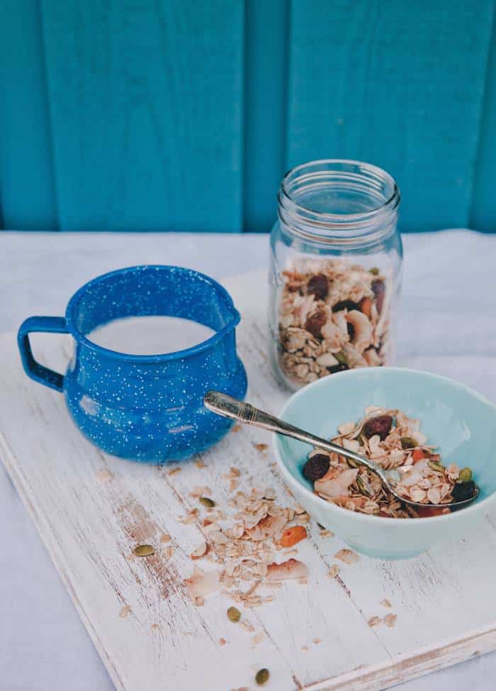
When a scene isn’t working, it’s often because of a misplaced element such as a piece of cutlery or glass, or the handle of a cup pointing the wrong way.
How Will I Use Light to Tell My Story?
Light is the most important element in photography.
Photography is essentially painting with light. If your shot is poorly exposed, no amount of Photoshop will completely fix it. But even once you are a pro at exposure, you still need to consider light as your main tool.
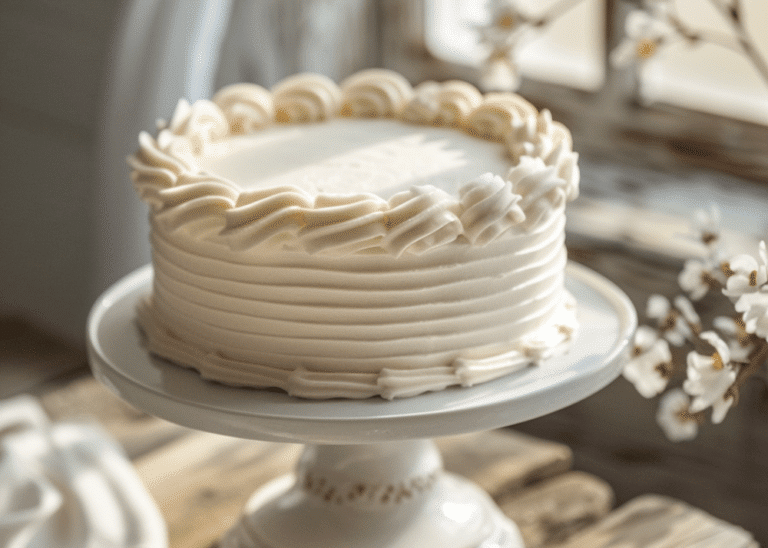
Many bloggers strive to create bright images as those favoured by sites like Foodgawker, but I would argue it can be too much of a good thing. Too much light in a photo, or images that are too white, can lack dimension.
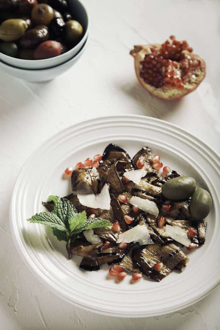
Consider the photo below, shot with a strobe light. Even though the scene is mostly white, apart from the food, there is still a shadow on and around the plate.
The interplay of light and shadow is important in creating images with dimension and vitality, whether you are going for bright and airy or moody and atmospheric.
In addition, the way your light hits your subject will also influence the way the story is told, as in my previous example of light streaming into a farmhouse window.
This idea of soft window light is a constant in my own work but I see many photographers employing hard and bright light in their imagery, which suits a more edgy and modern aesthetic but doesn’t suit my rustic style.
Think of three words that encapsulate your aesthetic and what lighting style would be most suitable to express it.
Quite often, you will notice that a lot of photographers are one-trick-ponies when it comes to lighting style. Sometimes it is most valuable to find what works for you and stick to it as much as possible.
I hope this peek into my own creative process will help you create a fresh approach to your own photography.
Stay tuned for more in this series on the topic of visual storytelling.


4 Responses
I’ve been shooting food photos for about a year now and it’s surprising how much my style continues to evolve. I look at photos from even a month ago and think I’ve grown so much more since then – I’m starting to be challenged a bit more by lighting because as you say, it’s the most important aspect of photography and story-telling. You’ve given me so much to think about here and I’m so glad to read a post that goes into this much detail on scene setting. I need to start thinking that way more often in my photos and while i don’t think I have it in me to sketch out mine in advance like you, I will continue with my own little bullet point list. I love your dark and moody style too Darina – I think mine can be too bright sometimes and It’s been on my to-do list to add some darker props to my collection. Maybe I will make a weekend project out of it!
Amazing that you have only been shooting photos for a year! You should have seen MY photos after one year. Horrendous! I’m glad that you found the post useful and can’t wait to see how you integrate some of the ideas into your work, Taylor. The sketching works for me but I don’t always do it. Whatever works for you. I think the important thing is to keep a theme in mind and you will find it all a lot easier. 🙂
This is an excellent read Darina..quite insightful for the beginners like me. You have gone into the detail to enhance the skill of photography to bring out the best out of the simplest picture. You have touched all aspects of food photography here.
Commendable.
Thank you so much, Prerna! It’s good to hear from you. I’m glad you are finding the information helpful 🙂 Thanks you for taking the time to comment.