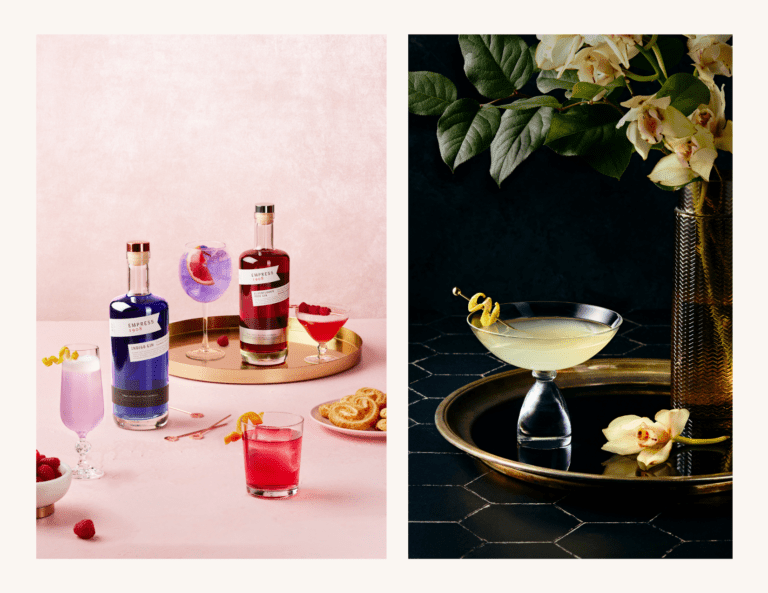
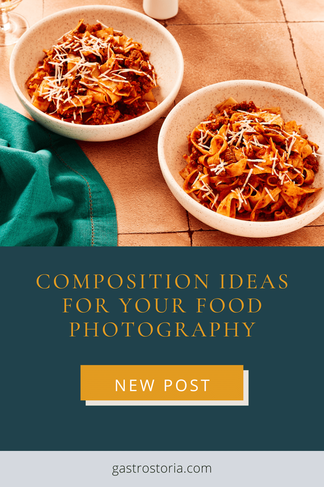
Do you find yourself stuck in a rut when it comes to composing your photos? This post will give you some composition ideas for your food photography.
Learning the principles of design is critical for developing a consistent and masterful body of work. This is a process, one that develops over the span of a lifetime of practicing your craft.
If you’re new to food photography, composition can feel awkward, and your photos may fall short of the vision you have for them. If you’re a more advanced photographer, you might feel stuck in a rut, recycling compositions that have worked well for you in the past because you don’t have the time to experiment and create something fresh.
In previous posts, I’ve written about composition principles, like this one and this one. This post is about quick and easy tips that you can implement right away to elevate your photos without having to stress about placement.
Focus on Layering Natural Textures
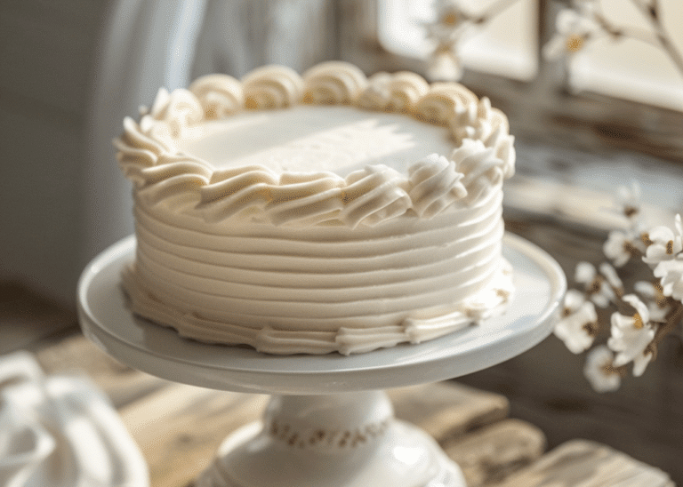
Texture is not often thought about as a compositional principle, but it’s one of the most important elements of a food photo.
Photography may be a visual medium, but our senses don’t operate in isolation: they inform one another as we experience the world around us.
Consciously thinking about texture when composing our photos will help us create more impactful images and food stories that invite the viewer into the world we have created within our frame.
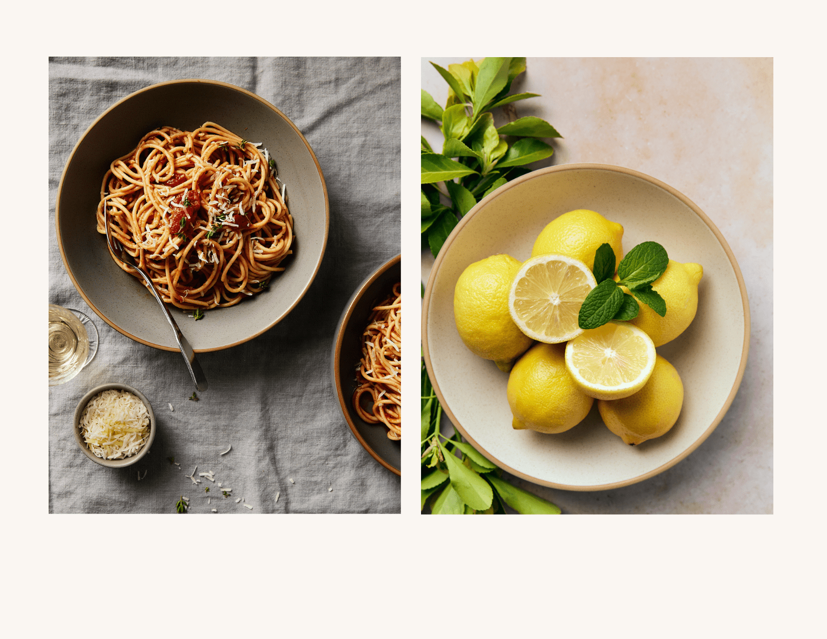
Here are some ways to add texture to your food photos:
- choose painted backdrops rather than those made from vinyl
- add branches, leaves, or florals when appropriate to the food story to add a rustic, organic touch
- use natural linen or cotton tablecloths as a backdrop to add a subtle texture and a homey vibe to your photos
- choose wood, ceramic, or marble dishes and props
- vintage cutlery with a patina will lend a sense of texture
When utilizing texture in your food photography, be sure to blend a variety of textures, from smooth to rough. Too much texture can overwhelm your viewer.
You should strive to create balance with everything you do in your food photography.
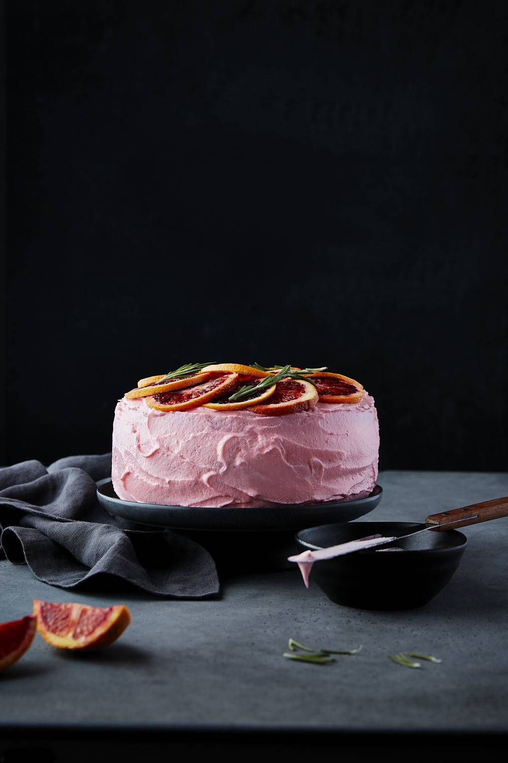
Incorporate Pattern into Your Food Stories
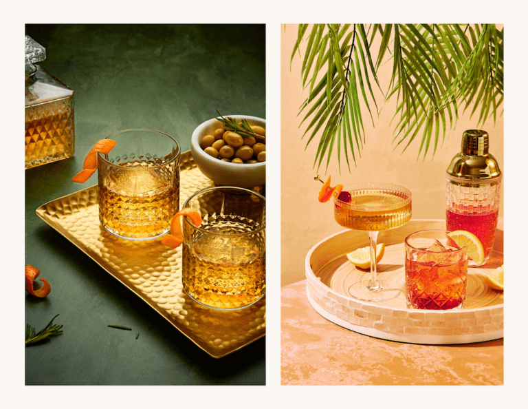
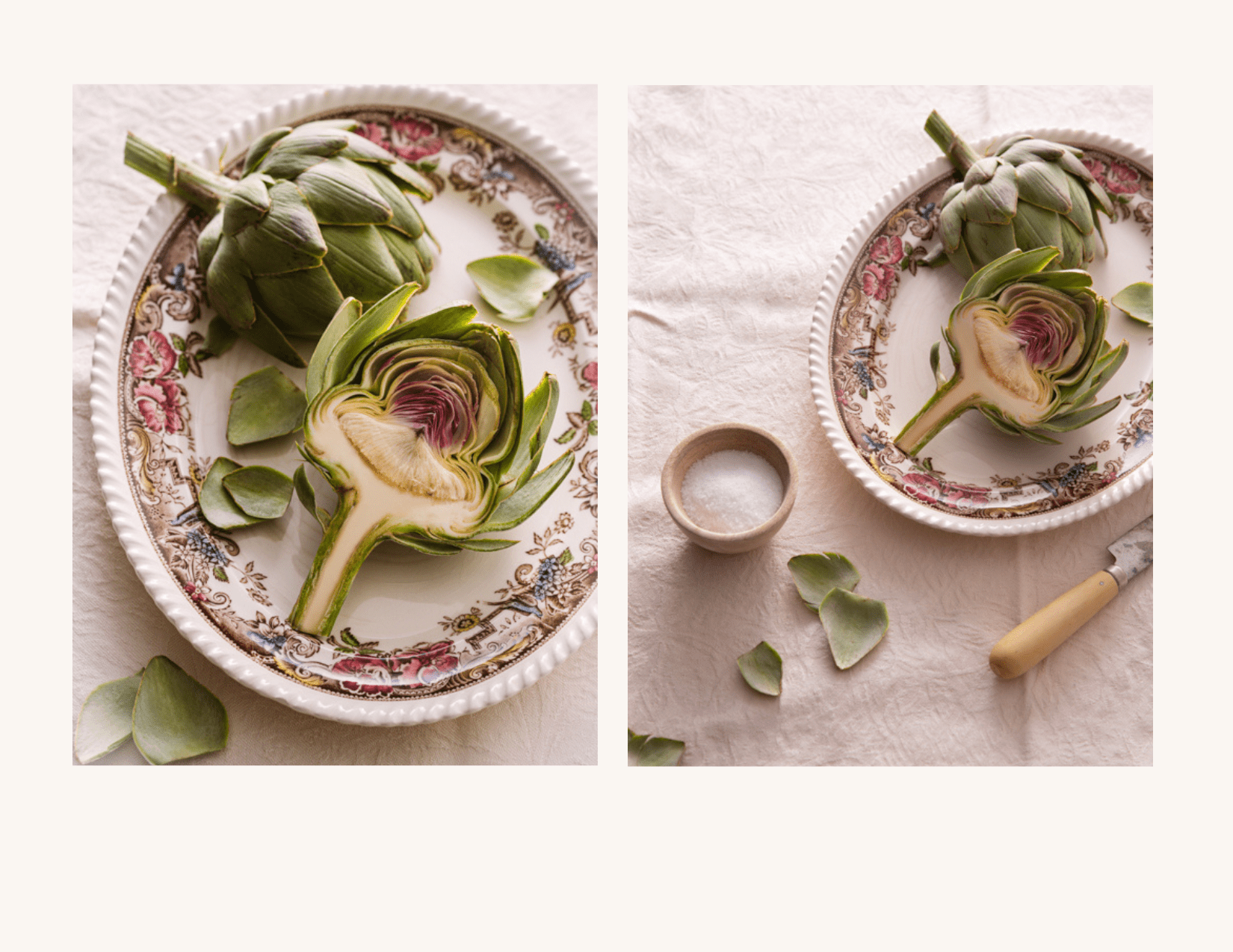
Are you afraid of pattern in your food photography props and backdrops? It’s often thought that patterns distract the viewer from the food subject— which is what your photo is supposed to be “selling”. However, when subtly and artfully done, a bit of pattern can go a long way to add depth and interest to your image.
When choosing dishes, look for subtle, monochromatic patterns. Bolder patterns are best left for the edges or rim of the dish where they won’t interfere with the food subject.
Pay Attention to Visual Weight and Balance
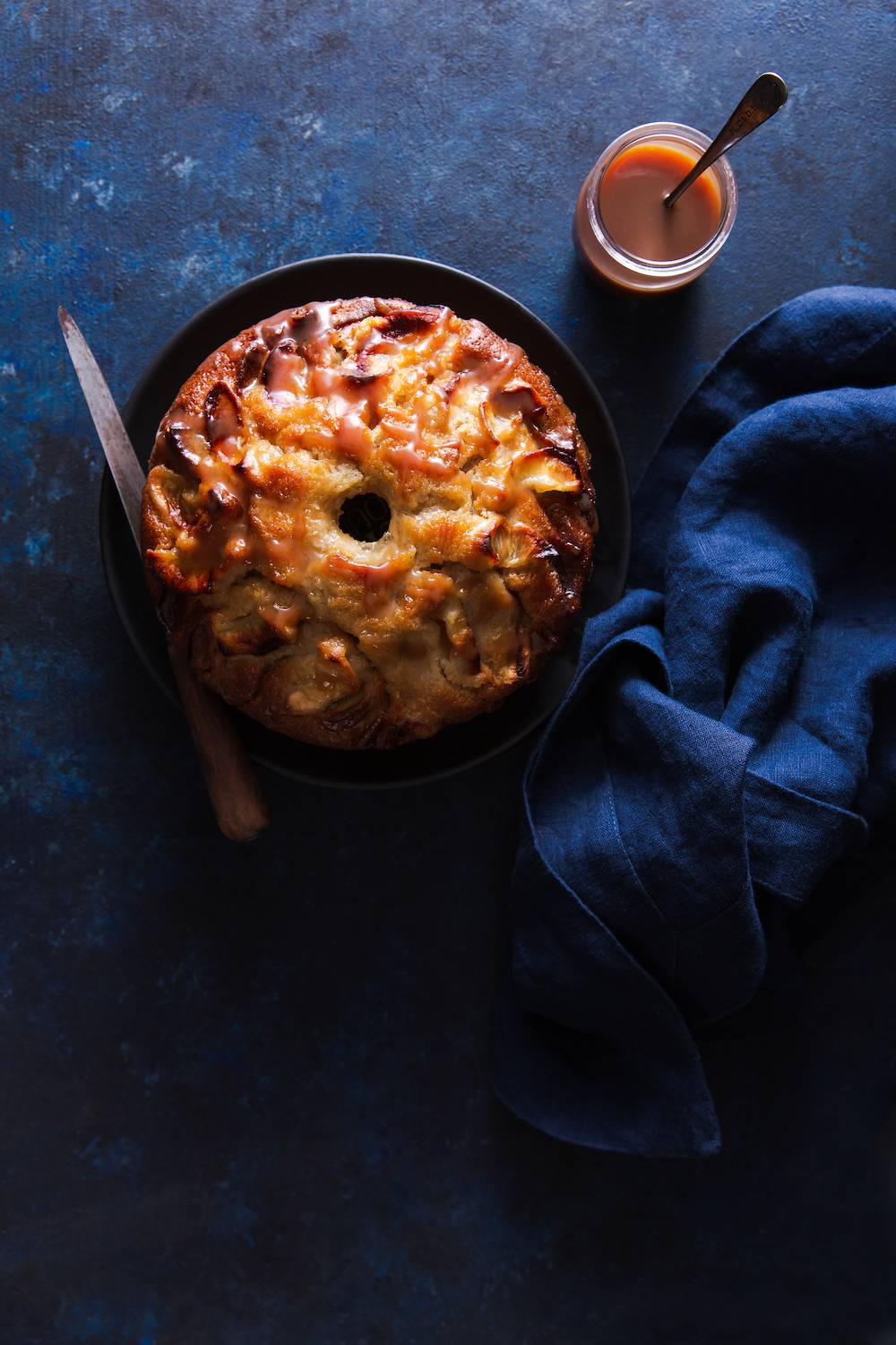
Visual weight is a compositional principle you don’t hear about that often but it’s a foundational one. It refers to how much a compositional element draws the eye and is the starting point for the placement of your subject.
Larger elements will naturally draw the eye first and therefore have higher or “heavier” visual weight. Therefore, your main food subject should take up the most space in the frame, with other compositional elements to balance it out.
The direction we read also has an influence on visual weight. In the Western world, we read text from left to right. We “read” a photo the same way: elements on the right of an image carry more visual weight than those placed on the left.
We tend to identify with a subject on the left, as it will appear closer and less “heavy” than one placed on the right.
Therefore, the subject with the most visual weight will look more balanced when placed on the left side of the frame than the right.
If you want to learn more about visual weight, be sure to check out this post.
Focus on the Rule-of Odds
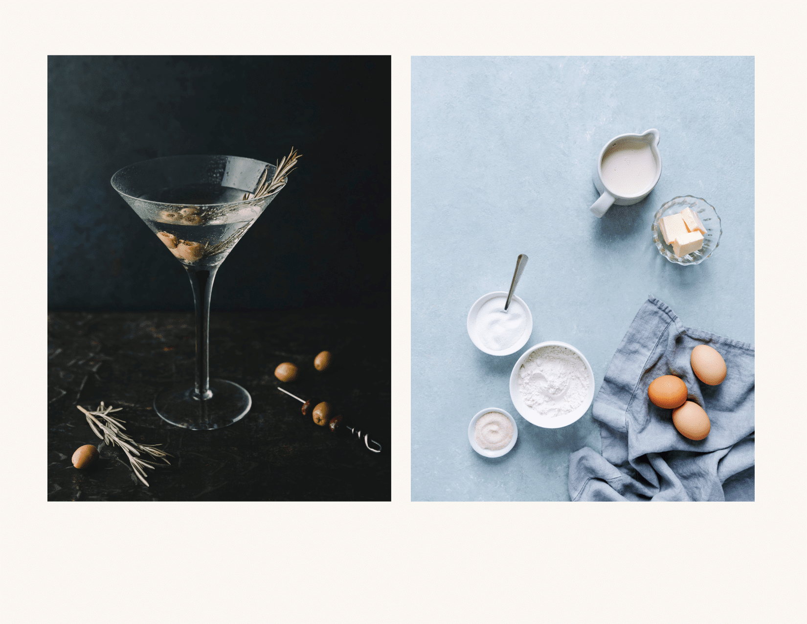
Utilizing the rule-of-odds as much as possible in your food photography is a sure way to ensure that you are creating impactful photos. Implementing this compositional principle will elevate even the most minimalistic image.
Odd numbers of elements such as three and five appear more balanced to the eye than an even number of elements. However, a larger number of elements—say nine—is harder for the brain to register, so in this case, you’ll want to place your subjects broken up into smaller groups.
PRO TIP: Who shopping for cutlery and dishes, purchase three of each item to have the most flexibility in your styling options, especially if you shoot a lot of flatlays.
Keep It Minimal
If you struggle with composition, keeping it minimal can be a good way to develop your skills until you feel comfortable moving on to more complex compositions.
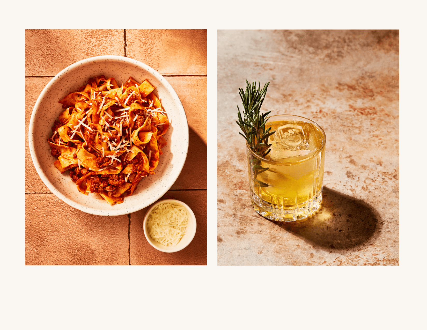
Note that simple isn’t always easy. When there are fewer items to play with, they’ll grab all the attention. This means that they must be perfect.
Nevertheless, starting with your main subject and adding one or two complementary elements is a great way to approach your composition and will allow the focus to stay on the food.
For example, you can add a pinch bowl with some parmesan alongside a dish of pasta, or a single piece of cutlery and a napkin.
Sketch Out Your Food Stories
The best food photography takes planning. When shooting professionally for clients, there is a lot that goes into pre-production to make sure things go smoothly on shoot day. You simply can’t pick up your camera and wing it.
Clients often have very specific demands for how they want their product shot and may even supply you with mock-ups to replicate.
If you shoot for your blog or do commissioned shoots in your home studio, you’ll have better results and work more efficiently by planning as much as possible in advance. Create some moodboards using an app like Pinterest or Moodboard and sketch out the compositions you want to do. You don’t have to be an artist—a rough idea of where you want to place things to follow the principles of composition will do.
Taking some time to sketch out your compositions will give you creative inspiration and help you avoid shooting images that are too similar.
Consult Your Colour Wheel
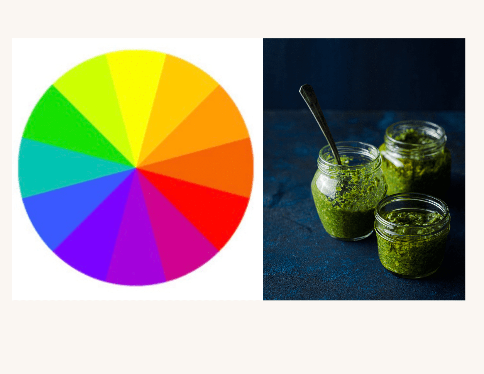
Have a colour wheel on hand when you’re planning your shots and use it to help break past the tried-and-true colour combinations we often see in food photography.
Food is typically warm in tone, so a complementary backdrop in its opposite—blue—is a go-to combination that works well for a lot of shots but can get a little boring.
Try more complex combinations such as triadic colour scheme i.e.: red, yellow, and blue, or by choosing colours next to one another on the colour wheel, such as purple and red, or green and blue. Whoever said “blue and green should never be seen” was dead wrong when it comes to food photography!
Create Compositional Elements with Light Patterns
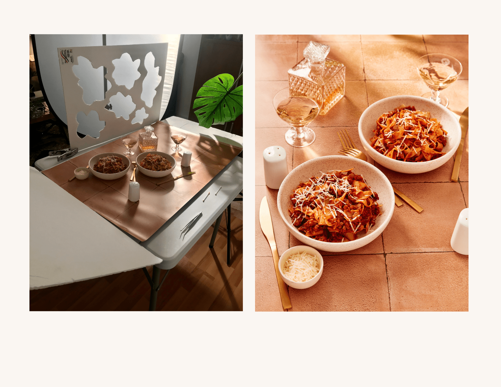
Don’t forget that light patterns are compositional elements also. Light patters can add pizzaz to what might otherwise be a very minimalist photo by taking up negative space and complementing the subject rather than distracting from it.
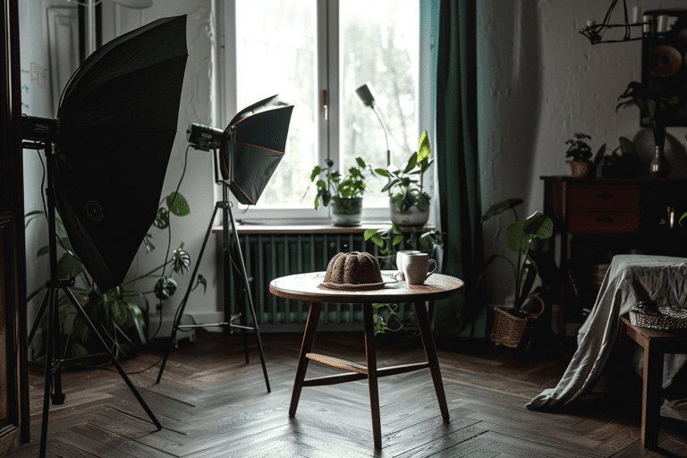
You can create light patterns by shooting through etched glass bottles, palm, or other intricate leaves such as Monstera or using a gobo go between optics).
You can carve patterns from pieces of white foamcore and position them above your set with a nightstand and a-clamp. The distance of the gobo between your light and set-up will influence how hard your shadows appear, so be sure to play around with the positioning until you get the look you want.
Break Out of a Rut with Composition Overlays
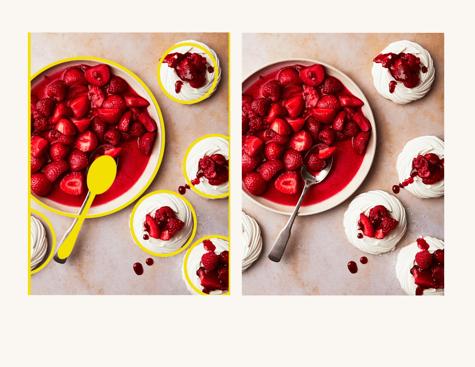
When working as a professional food photographer, it’s common for a client to give you an overlay of the artwork required for a product package or magazine cover or spread. Using this overlay during tethered capture will ensure that the various elements in your scene don’t interfere with text or logos or other elements that will be printed over the final photo.
I have created overlays to help you with your own compositions. If you’re still getting the hang of composition, or find that you’re stuck in a rut, recreating the same old tired compositions that you tend to do, these overlays can be the perfect way to shake things up. Compose impactful images in real time without having to second guess where to place everything.
Utilizing them will ensure that you are implementing timeless compositional principles, but these overlays are simple enough to give you endless inspiration for your food photography.
To Sum Up
When approaching your set-ups, use these quick and easy tips to elevate your photos. It’s often the little, simple things that can make a big difference. Great food photography brings together a multitude of small details done right.
Do you need a crash course in the principles of composition? Be sure to check out my eBook Rule-of-Thirds: A Guide to Composition for Food Photography . This guide will give you a better understanding of how to implement the rules of composition with simple guidance and real-life examples. the tools to take your food photography to the next level.

