Composing for food photography can be a lot more complex than implementing principles like the rule-of-thirds or even the golden ratio.
Don’t get me wrong, these basics are such important foundational knowledge that I wrote a book about them. But to truly elevate your food photography, there are other compositional techniques you should pay attention to when creating your set-ups.
In this post, I’m going to talk about layering, a concept that is used in a variety of design modalities, and can make a powerful visual impact on your photos.
Layering is a powerful yet often overlooked composition technique, but if you’re using props in your photography, you’re already using this concept —perhaps without realizing it.
What is Layering?
Layering is a concept that can be found in every photographic genre and can be utilized in a couple of different ways.
The purpose of consciously layering the elements of your photo is to add visual depth to a two-dimensional medium, and to create a deeper story.
At a basic level, every photo has a foreground, background, and a middle. Specific techniques applied to each part of the image—such as using lighting, depth-of-field, adding movement via shutter speed etc.—creates a layered effect, and a more powerful image
This is one way of layering. The other more obvious way of layering is to stack objects on top of each other. In food or still life photography, this is your props, backdrops, and linens.
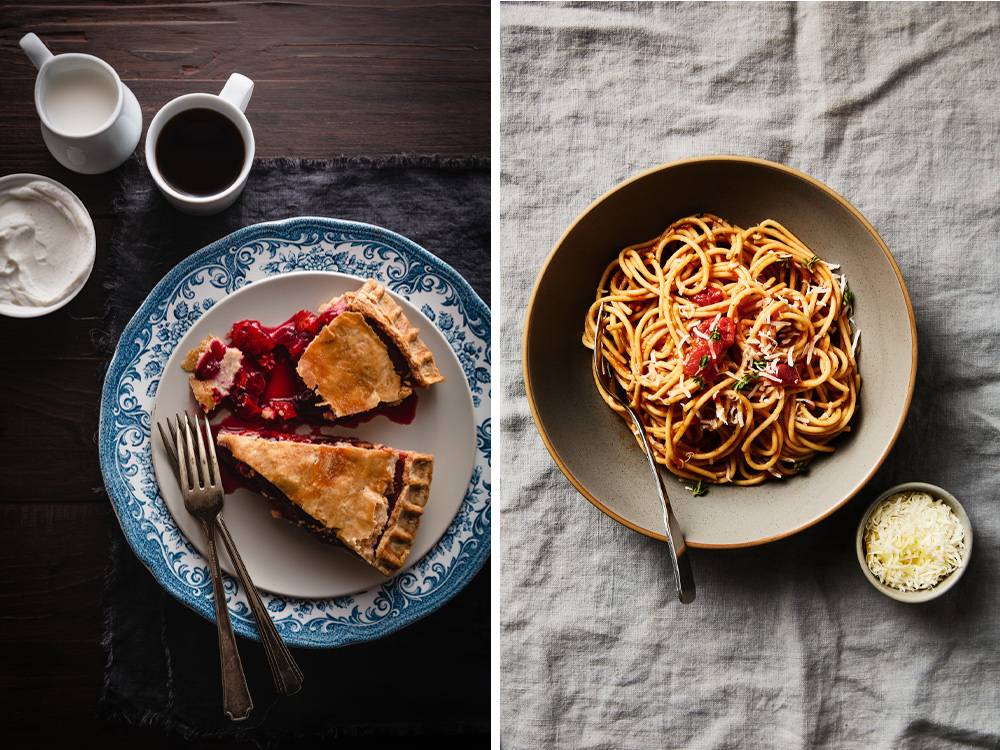
In the image of the pie below, there are several layers in addition to the food subject, which also constitutes a layer. The wooden table, the frayed linen, and the two plates—one of which is patterned with a traditional motif—combine to provide a rustic, homey mood and help you imagine when and where the scene might be taking place, such as a farmhouse in autumn.
Conversely, the shot of the spaghetti on the right has fewer layers and the impact of the photo is due to the colour tones, the blending of textures and focus on the food subject. There isn’t as much of a sense of narrative or focus on storytelling.
The Fundamentals of Layering
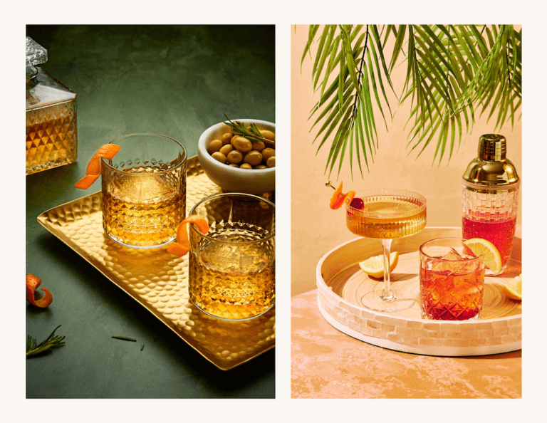
Layering is not about clutter. It’s about blending different textures, materials, colours, shapes, and patterns to create a harmonious image with visual interest. Movement is also created through layers of height, shape, size, colour, texture, scale, and pattern.
These various elements should cohesively blend with each other in order to add depth to your photo.
You also want to make sure that you have some negative space around the objects in your photo so they can breathe, and to allow the eye to travel seamlessly through the image.
Correctly done, the food subject will pop while all the other elements in the scene work together in harmony without vying with one another for the viewer’s attention.
The Importance of Texture in Layering
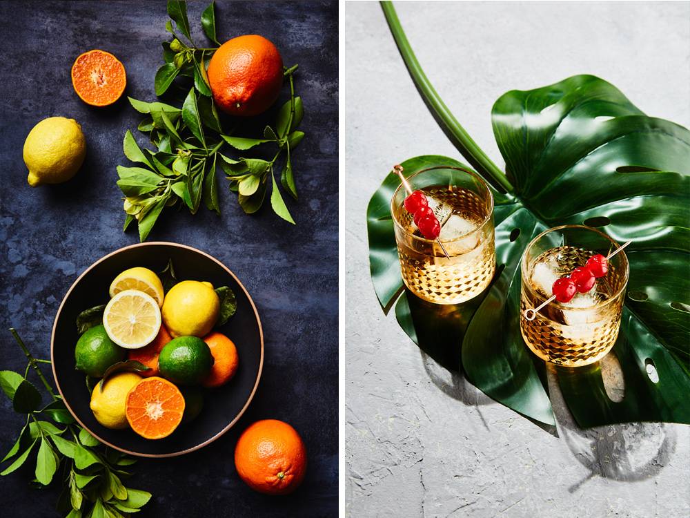
Texture is not often thought of as a compositional principle, but it’s one of the most crucial elements in a food photo. Since we cannot feel the textures in a photo, we need to experience them visually. Texture is an important part of eating, so paying attention to how you use texture can immediately make a difference in your work.
Tactile texture is defined as the surface quality of a material: soft, rough, smooth, sharp, rigid etc. Visual texture refers to the aesthetic of the material and its visual quality.
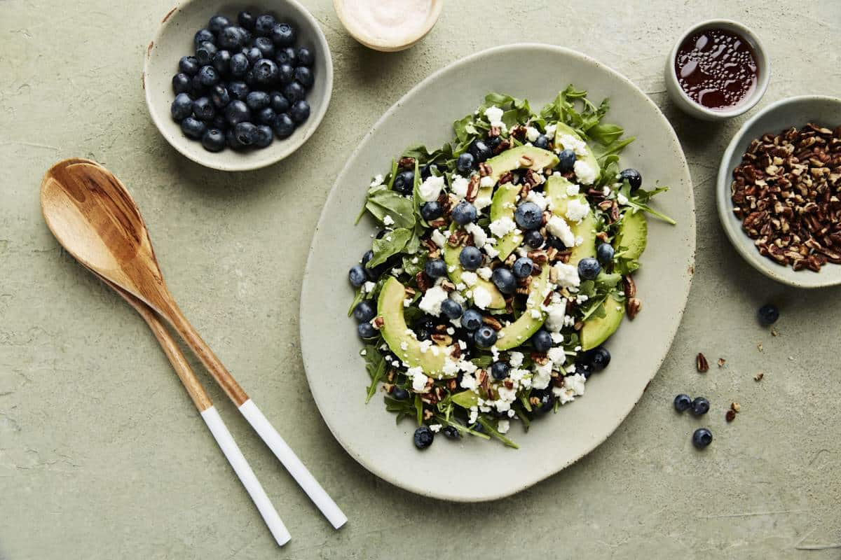
When layering texture, don’t forget that your food subject has texture. The other textures you use should complement it. In other words, if your food subject has a lot of texture, like a salad, go easy on the texture in your backdrop and props.
If you’re shooting something smooth, like a soup, you can use a backdrop that is more textured, as seen in the image below.
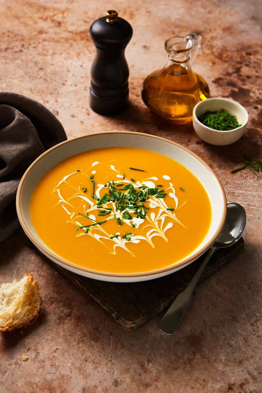
Also, don’t forget that light has a big influence on texture. Different textures are affected by light differently. For example, coarse and tactile textures like burlap absorb more light, whereas cutlery and dishes can be quite shiny and reflect it.
Find creative ways to mix complementary textures. Sometimes an unlikely combination can give you the biggest impact.
For a deep dive into texture for food photography, check out this blog post.
Use Colour and Pattern for Visual Interest
Colour has a lot of power to make or break your photo. The right tones in your backdrops and props will elevate your food subject, but the wrong ones will distract the viewer. For example, a brightly coloured napkin in an otherwise neutral or monochromatic image may pull all the attention away from the food.
Consider that many foods are warm in colour. Choosing cool toned backgrounds and props can be a good place to start when you’re unsure about working with colour, as they are complementary.
Layering colours in the same colour family can also be a way to create a more dynamic image without being distracting.
Patterns can be tricky in food photography. Incorrectly utilized, they can distract from the food subject, which is never a good idea, as the food is what you’re trying to “sell” in the image. However, patterns can add character, harmony, and cohesion to your photo.
Experiment by mixing colourful and neutral patterns, or small, medium and larger prints. Or if you have a bold pattern, use it one its own and make sure the other props are simple and neutral.
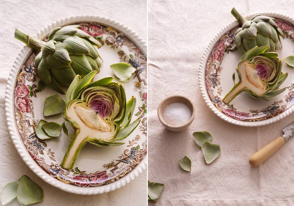
In the set-up below, the pattern on my plate appears only around the perimeter, so as not interfere with the colour and high texture of artichoke. The damask tablecloth is patterned, which adds texture and interest but in a subtle way, as it is neutral in colour. This is a good example of combining different patterns that you can use as a prompt in your own work.
When incorporating pattern, balance is the key.
Use the Rule-of-Odds to Create Harmony
The rule-of-odds states that when photographing a group of objects, an odd number of elements is more interesting than an even number. Odd numbers create a sense of balance and a resting point for the eyes, whereas an even number of objects can divide our attention.
The rule-of-odds works as it taps into the brain’s inclination to create order out of what we see. When viewing a group of objects, we unconsciously want to group them in pairs.
However, when faced with three, five, or seven objects in a photograph, we have a group that can’t be easily organized. We’ll look spend more time looking at the image, our eyes moving between the individual elements.
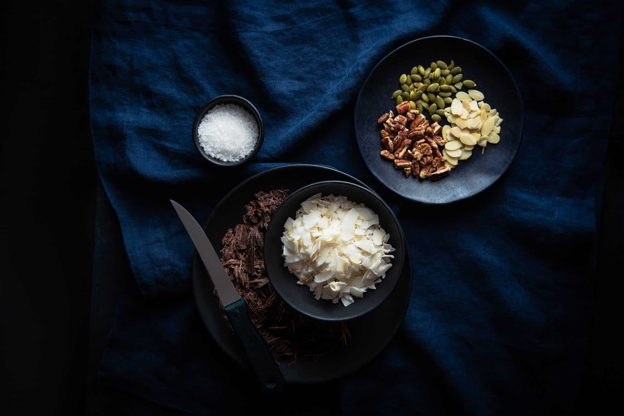
The rule-of-odds forces our brains to work a little harder and stay engaged in the composition. When composing your scenes, use three or five elements. Any more than that, you’re risking visual clutter. However, this can be mitigated by creating smaller groups of odds from those elements.
Build and Assess your Scene
Think about where you want the main energy and visual interest in your image to come from? Do you want the layers to be subtle, focused primarily on texture and patterns inherent in your food subjects, or do you want to make an impact through the intentional use of colour, print, and scale?
Choose a backdrop to complement your subject and add one element to your scene at a time. Assess each object and its placement and impact and make tweaks as necessary.
Be sure to evaluate the proportion and scale of your compositional objects to ensure they work in harmony.
To Sum Up
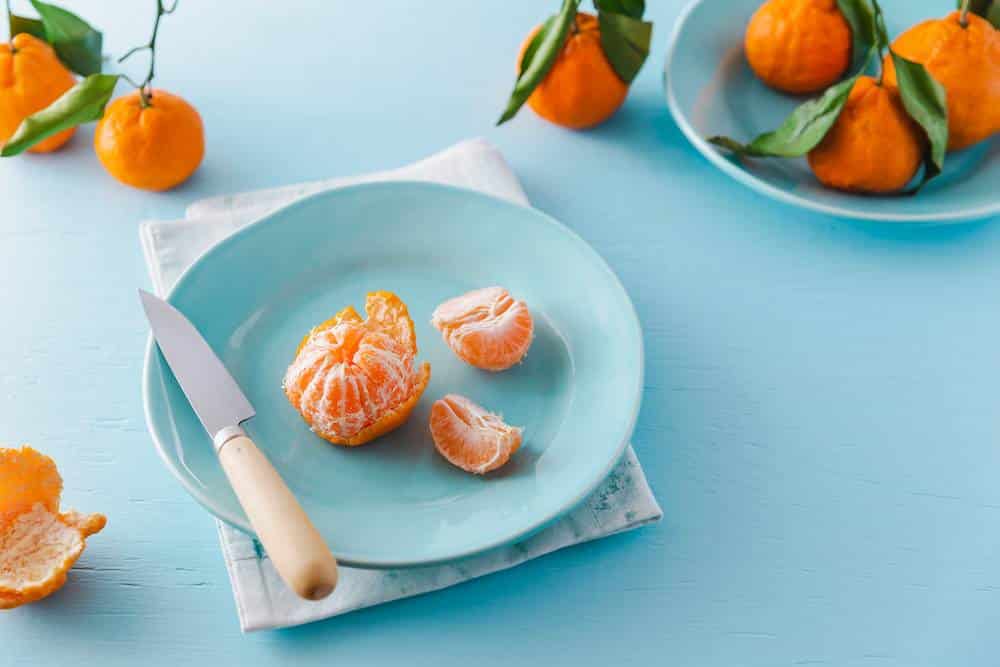
You may already be familiar with some of these principles involved in layering. That is because the principle of composition and design overlay and work together to as guides to better photography.
Consciously taking the time to think about the various aspects of layering your set-up and the image emerging in your frame will make all the difference in your food photos.
Want to learn more about composition for food photography? Check out my eBook Rule-of-Thirds: A Guide to Composition for Food Photography. You’ll learn all the basics about important principles in composing your food photos such as the Golden Ratio. This interactive PDF eBook also has 42 templates that you can use as guides to help you set up your food photos in a way that follows the principles of good composition.



One Response
I love layering. I’m not what you would call a minimalist 😉 so I think of fashion icon Coco Chanel’s famous quote. “When accessorizing, always take off the last thing you put on”. It’s a great rule for food styling too! Great tips here Darina.