In a previous post, I wrote about some flatlay tips. Here are a few more.
To recap, the food photography flatlay has been incredibly popular in the last few years. The term “flatlay” is a term borrowed from the editorial photography world to describe an overhead shot (taken at ninety degrees), often of several elements composed within the frame.
The popularity of the flatlay exploded with the advent of Instagram. Before that, it wasn’t a style you often seen in traditional food photography. The wide-angle lens of a camera phone means that shots taken at a 3⁄4 angle look distorted. The food looks like it’s sliding off the table.
Photos look much better when take from overhead or straight on, and early users of Instagram figured this out pretty quickly.
The flatlay trend may have started on Instagram, but now you see the flatlays everywhere and there is no evidence of the trend fading out.

Use the Right Subject
A successful flatlay starts with the right subject.
Flatlays can be easier to compose because they allow you to fit several elements into the frame. This reduces some of the challenges that come with attempting to create depth in a photo. Overhead shots emphasize shape and flatten depth, so this approach is not suitable for all food subjects.
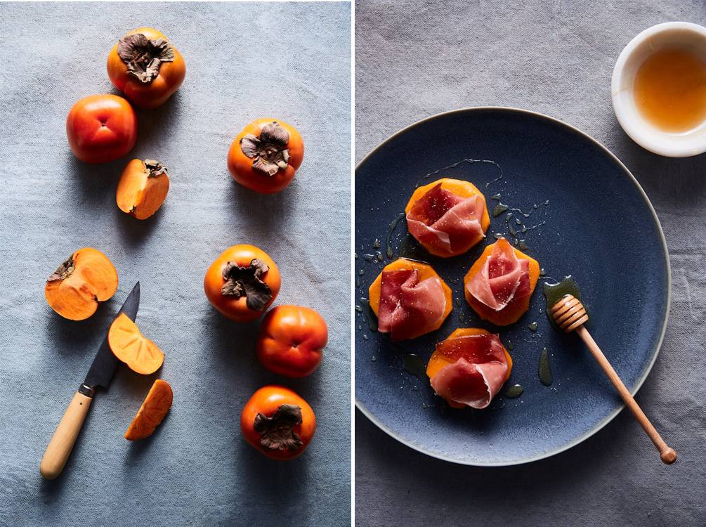
Tall foods like burgers or stacks of pancakes are not usually shot overhead because we want to see what’s in the layers, not just the top of a burger bun. On the other hand, a pizza will often be photographed at ninety degrees because we’re most interested in the toppings and shape–unless the emphasis needs to be in the stringiness of the cheese, as in a “pizza pull” shot.
Before you shoot, you should decide if a flatlay will highlight the best features of your food or if you need to try a different camera angle.
Props and Surfaces Should Complement the Main Subject
Props should never dominate an image or pull the viewer away from the main subject. They are there to give context to the dish—not distract from it. Props need to be chosen with care, and work in service of the story.
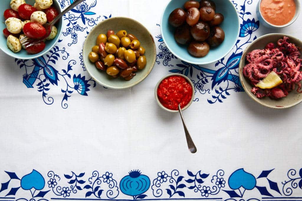
Although the tablecloth in the image below is bright and a bit busy, it gives context to the tapas. It allows the viewer to quickly understand that this is a Mediterranean tablescape, and visualize where this meal may be taking place.
Your choice of color for your surface is even more important for the flatlay than when you shoot at other angles. The ninety degree angle flattens depth, therefore the color is an even more conspicuous aspect of the
composition. Although patterns like this can be used effectively, make sure that the work in terms of the aesthetics of the final result that is sought.
Create Balance in Your Frame
In a previous blog post about visual weight, I talk about how some elements in a frame attract the eye more than others. This is the concept of visual weight.
Visual weight depends on several factors, but the size of your compositional elements is one of the crucial ones. This is why in food photography, you want your plate of food, or your subject, to be larger than your props or supplementary elements. It needs to dominate the image so it can draw the eye first.
Therefore, unless you’re placing your subject smack-dab in the middle, you’ll need to create balance in the frame with some smaller subjects or props.
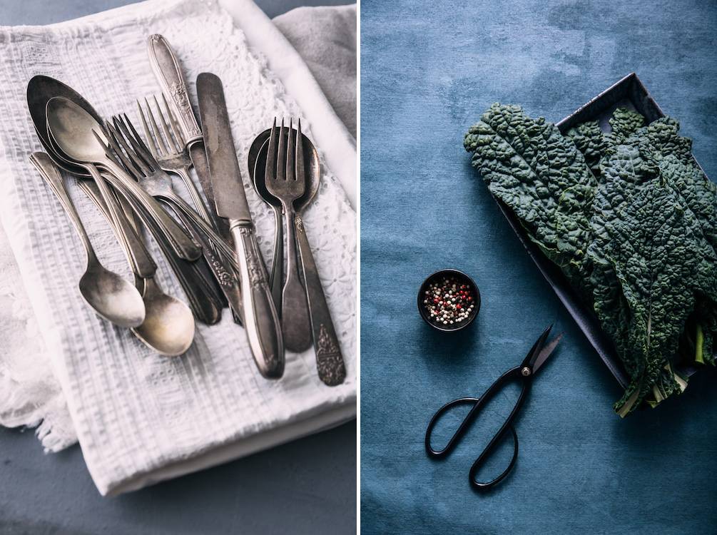
This can be as simple as a piece of linen, or you can add a piece of cutlery and pinch bowl.
In the image below, the visual weight of the bowl is balanced out by the spoon, and the sprinkling of the hemp hearts and blueberries on the surface. These items add texture, provide context, and balance out the heavy visual weight of the yogurt bowl.
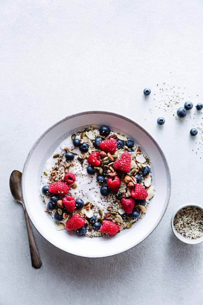
By thinking of balance when approaching your flatlay, you will also in turn also create negative space, which will allow the eye to flow through your scene with interest.
Composing your food photos with diagonal lines and implied triangles will naturally lead to a balance of negative space and make your food photos dynamic.
On the other hand, composing along soft curves, such as an s-shape or c- shape gives a calmer feeling than composing them along varying diagonal lines—whether these are literal or implied.
Bottom line—images with very little negative space tend to feel chaotic to the viewer, and can make them feel an unconscious sense of claustrophobia.
Utilize the Rule-of-Odds
The rule-of-odds is one of the most powerful compositional principles available to you when composing your flatlay, as there are often many visual elements, such as in a tablescape.
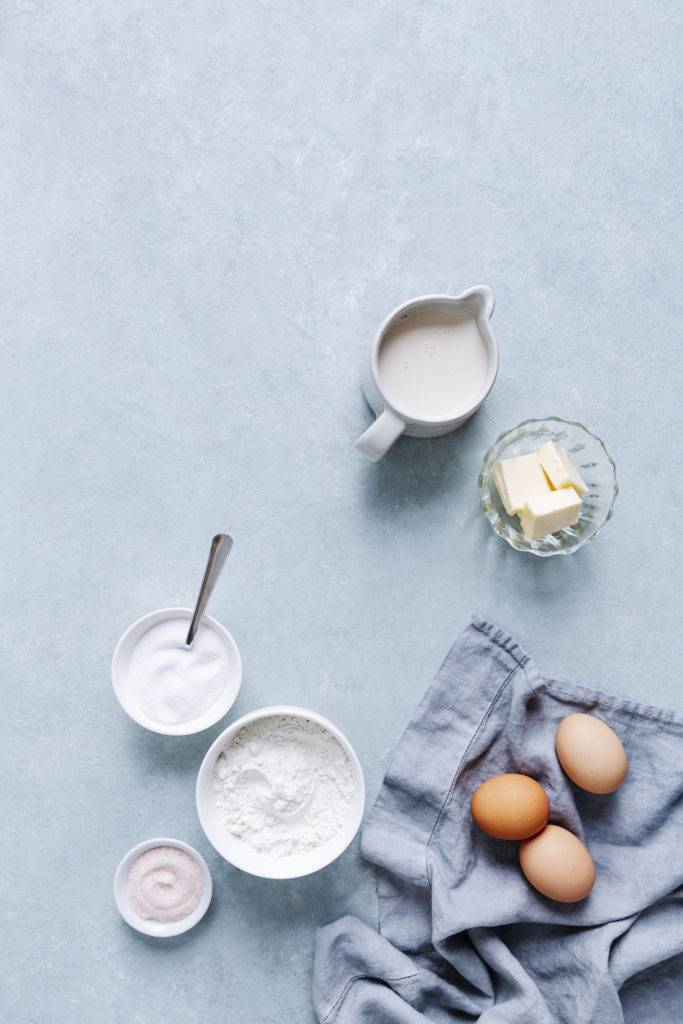
To keep the image from looking chaotic or claustrophobic to the viewer, grouping elements into odd numbers will create negative space and a sense of flow, which also making the image appear more dynamic by automatically creating diagonals and implied triangles as mentioned in the previous tip.
In the image below, I composed my subjects using odd numbers. I have a group of three and a larger group of five, with lots of negative space for text, as was required for the shot.
Want more composition tips? Check out my eBook Rule-of-Thirds: A Guide to Composition for Food Photography. You’ll learn all the basics about important principles in composing your food photos such as the Golden ration. This interactive PDF ebook also has 42 templates that you can use as guides to help you set up your food photos in a way that follows the principles of good composition.

